@import url('https://fonts.googleapis.com/css2?family=Newsreader:ital,opsz,wght@0,6..72,300;0,6..72,400;1,6..72,300&family=Plus+Jakarta+Sans:wght@400;500;600&display=swap');
html{scroll-padding-top:110px}
#smm{display:block;max-width:none!important;width:100%!important;margin:0!important;padding:0!important;text-align:left;overflow-wrap:normal}
#smm [hidden]{display:none!important}
#smm h1,#smm h2,#smm h3,#smm h4{color:inherit;letter-spacing:normal;text-transform:none;padding:0;clear:none}
#smm blockquote{border:0;padding:0;background:none;quotes:none;color:inherit}
#smm blockquote::before,#smm blockquote::after{content:none}
#smm figure,#smm li{margin:0}
#smm ul,#smm ol{margin:0;padding:0}
#smm table,#smm th,#smm td{border:0}
#smm input,#smm select{box-shadow:none;margin:0;max-width:none;line-height:normal}
#smm iframe{max-width:none}
:where(#smm) button,:where(#smm) button:hover,:where(#smm) button:focus{background-color:transparent;color:inherit;box-shadow:none;text-transform:none;letter-spacing:normal;line-height:inherit;border-radius:0;padding:0;font:inherit}
body.admin-bar #smm .smm-site-header{top:32px}
@media (max-width:782px){body.admin-bar #smm .smm-site-header{top:46px}}
@media (max-width:600px){body.admin-bar #smm .smm-site-header{top:0}}
#smm{--paper: #FBF7F0; --linen: #F1E8DA; --mist: #DDE7EF; --ink: #1E2A47; --slate: #5A6378; --dusty: #86A9C6; --butter: #EDD68A; --clay: #E3897A; --footer-muted: #B9C3D6; --field-line: #C9BFAE; --serif: 'Newsreader', Georgia, 'Times New Roman', serif; --sans: 'Plus Jakarta Sans', 'Helvetica Neue', Arial, sans-serif; --gutter: clamp(20px, 5.5vw, 80px); --section: clamp(64px, 9vw, 120px); color-scheme: light;}
#smm,#smm *,#smm *::before,#smm *::after{box-sizing: border-box;}
html{scroll-behavior: smooth;}
@media (prefers-reduced-motion: reduce){html{scroll-behavior: auto;}}
#smm{margin: 0; background: var(--paper); color: var(--ink); font-family: var(--sans); font-size: 17px; line-height: 1.7; -webkit-font-smoothing: antialiased;}
#smm img{max-width: 100%; height: auto; display: block;}
#smm a{color: var(--ink); text-underline-offset: 6px;}
#smm a:hover{color: var(--slate);}
#smm :focus-visible{outline: 2px solid var(--ink); outline-offset: 3px; border-radius: 4px;}
#smm p{margin: 0;}
#smm h1,#smm h2,#smm h3{margin: 0; font-family: var(--serif); font-weight: 300; line-height: 1.1; text-wrap: balance;}
#smm .smm-skip{position: absolute; left: -999px; top: 0; background: var(--ink); color: var(--paper); padding: 10px 16px; z-index: 100;}
#smm .smm-skip:focus{left: 16px; top: 16px;}
#smm .smm-wrap{width: 100%; max-width: 1440px; margin: 0 auto; padding-left: max(var(--gutter), env(safe-area-inset-left, 0px)); padding-right: max(var(--gutter), env(safe-area-inset-right, 0px));}
#smm .smm-section{padding-block: var(--section);}
#smm .smm-section--tight-top{padding-top: 0;}
#smm .smm-label{font-size: 13px; font-weight: 600; letter-spacing: 0.14em; text-transform: uppercase; color: var(--slate); line-height: 1.4;}
#smm .smm-display{font-size: clamp(46px, 6.6vw, 92px); line-height: 1;}
#smm .smm-h1{font-size: clamp(42px, 5.6vw, 76px); line-height: 1.02;}
#smm .smm-h2{font-size: clamp(32px, 3.9vw, 56px);}
#smm .smm-h2--sm{font-size: clamp(30px, 3.1vw, 44px);}
#smm .smm-h3{font-size: clamp(26px, 2.4vw, 34px); font-weight: 400;}
#smm .smm-lede{font-size: clamp(18px, 1.5vw, 20px); max-width: 62ch;}
#smm .smm-prose{display: flex; flex-direction: column; gap: 18px; max-width: 64ch;}
#smm .smm-muted{color: var(--slate);}
#smm .smm-hl{background: linear-gradient(transparent 60%, var(--butter) 60%, var(--butter) 92%, transparent 92%);}
#smm .smm-stack{display: flex; flex-direction: column; gap: 24px; min-width: 0;}
#smm .smm-stack--lg{gap: 48px;}
#smm .smm-split{display: grid; grid-template-columns: 280px minmax(0, 1fr); gap: 40px;}
#smm .smm-split > .smm-label,#smm .smm-split > .smm-split__side{padding-top: 14px;}
#smm .smm-split__side{display: flex; flex-direction: column; gap: 24px;}
@media (max-width: 900px){#smm .smm-split{grid-template-columns: minmax(0, 1fr); gap: 20px;}
#smm .smm-split > .smm-label,#smm .smm-split > .smm-split__side{padding-top: 0;}}
#smm .smm-btn{display: inline-flex; align-items: center; gap: 14px; min-height: 52px; padding: 0 26px; border-radius: 999px; border: 1.5px solid var(--ink); background: transparent; color: var(--ink); font: inherit; font-size: 16px; font-weight: 600; text-decoration: none; cursor: pointer; transition: background-color .2s ease, color .2s ease;}
#smm .smm-btn:hover{background: var(--ink); color: var(--paper);}
#smm .smm-btn svg{flex: none; transition: transform .2s ease;}
#smm .smm-btn:hover svg{transform: translateX(4px);}
#smm .smm-btn--fill{background: var(--clay); border-color: var(--clay); color: var(--ink); min-height: 58px; padding: 0 32px; font-size: 17px;}
#smm .smm-btn--fill:hover{background: var(--ink); border-color: var(--ink); color: var(--paper);}
#smm .smm-btn--light{border-color: var(--paper); color: var(--paper);}
#smm .smm-btn--light:hover{background: var(--paper); color: var(--ink);}
#smm .smm-link{font-weight: 600; text-decoration: underline; text-underline-offset: 7px;}
#smm .smm-round{flex: none; display: inline-flex; align-items: center; justify-content: center; width: 60px; height: 60px; border-radius: 999px; border: 1.5px solid var(--ink); text-decoration: none; transition: background-color .2s ease;}
#smm .smm-round:hover{background: var(--ink);}
#smm .smm-round:hover svg{stroke: var(--paper);}
@media (prefers-reduced-motion: reduce){#smm .smm-btn,#smm .smm-btn svg,#smm .smm-round{transition: none;}}
#smm .smm-site-header{position: sticky; top: env(safe-area-inset-top, 0px); z-index: 50; background: var(--paper);}
#smm .smm-site-header__bar{display: flex; align-items: center; justify-content: space-between; gap: 24px; padding-block: 16px;}
#smm .smm-site-header__logo img{height: 70px; width: auto; mix-blend-mode: multiply;}
#smm .smm-nav{display: flex; align-items: center; gap: 36px;}
#smm .smm-nav__list{display: flex; align-items: center; gap: 34px; list-style: none; margin: 0; padding: 0;}
#smm .smm-nav__item{position: relative;}
#smm .smm-nav__link{display: flex; flex-direction: column; gap: 1px; text-decoration: none; background: none; border: 0; padding: 4px 0; font: inherit; color: var(--ink); cursor: pointer; text-align: left;}
#smm .smm-nav__reo{font-size: 12px; color: var(--slate); line-height: 1.3;}
#smm .smm-nav__en{font-size: 16px; font-weight: 500; line-height: 1.4;}
#smm .smm-nav__link[aria-current="page"] .smm-nav__en{text-decoration: underline; text-underline-offset: 6px;}
#smm .smm-nav__sub{position: absolute; top: 100%; left: -18px; min-width: 220px; list-style: none; margin: 0; padding: 10px; background: var(--paper); border-radius: 14px; box-shadow: 0 10px 30px rgba(30, 42, 71, .12); display: none;}
#smm .smm-nav__sub a{display: block; padding: 10px 12px; border-radius: 10px; text-decoration: none; font-weight: 500;}
#smm .smm-nav__sub a:hover{background: var(--linen); color: var(--ink);}
#smm .smm-nav__item--sub:hover .smm-nav__sub,#smm .smm-nav__item--sub:focus-within .smm-nav__sub,#smm .smm-nav__item--sub.smm-is-open .smm-nav__sub{display: block;}
#smm .smm-menu-btn{display: none; width: 48px; height: 48px; border-radius: 999px; border: 1.5px solid var(--ink); background: transparent; align-items: center; justify-content: center; cursor: pointer;}
@media (max-width: 1080px){#smm .smm-site-header__logo img{height: 52px;}
#smm .smm-menu-btn{display: inline-flex;}
#smm .smm-nav{display: none; position: absolute; left: 0; right: 0; top: 100%; flex-direction: column; align-items: stretch; gap: 20px; padding: 8px max(var(--gutter), env(safe-area-inset-right, 0px)) 28px max(var(--gutter), env(safe-area-inset-left, 0px)); background: var(--paper); box-shadow: 0 14px 24px rgba(30, 42, 71, .08);}
#smm .smm-nav.smm-is-open{display: flex;}
#smm .smm-nav__list{flex-direction: column; align-items: stretch; gap: 4px;}
#smm .smm-nav__link{padding: 10px 0;}
#smm .smm-nav__sub{position: static; display: block; box-shadow: none; padding: 0 0 6px 14px; min-width: 0; background: transparent;}
#smm .smm-nav__sub a{padding: 8px 0;}
#smm .smm-nav .smm-btn{justify-content: center;}}
#smm .smm-edge{height: 40px; background-color: var(--paper); background-repeat: repeat-x; background-size: 160px 40px;}
#smm .smm-edge--up{background-image: radial-gradient(circle at 80px 100px, var(--c) 99.5px, transparent 100px);}
#smm .smm-edge--down{background-image: radial-gradient(circle at 80px -60px, var(--c) 99.5px, transparent 100px);}
@media (max-width: 700px){#smm .smm-edge{height: 28px; background-size: 104px 28px;}
#smm .smm-edge--up{background-image: radial-gradient(circle at 52px 62.3px, var(--c) 61.8px, transparent 62.3px);}
#smm .smm-edge--down{background-image: radial-gradient(circle at 52px -34.3px, var(--c) 61.8px, transparent 62.3px);}}
#smm .smm-c-linen{--c: var(--linen);}
#smm .smm-c-mist{--c: var(--mist);}
#smm .smm-c-ink{--c: var(--ink);}
#smm .smm-band--linen{background: var(--linen);}
#smm .smm-band--mist{background: var(--mist);}
#smm .smm-scallop{-webkit-mask: radial-gradient(circle at 14px 14px, #000 13.5px, transparent 14px) top left / 28px 14px round no-repeat, radial-gradient(circle at 14px 0, #000 13.5px, transparent 14px) bottom left / 28px 14px round no-repeat, linear-gradient(#000, #000) center / 100% calc(100% - 26px) no-repeat; mask: radial-gradient(circle at 14px 14px, #000 13.5px, transparent 14px) top left / 28px 14px round no-repeat, radial-gradient(circle at 14px 0, #000 13.5px, transparent 14px) bottom left / 28px 14px round no-repeat, linear-gradient(#000, #000) center / 100% calc(100% - 26px) no-repeat;}
#smm .smm-ph{position: relative; display: flex; align-items: flex-end; padding: 18px 20px; background: var(--mist); color: var(--slate); font-size: 14px; line-height: 1.5; overflow: hidden;}
#smm .smm-ph--linen{background: var(--linen);}
#smm .smm-ph img{position: absolute; inset: 0; width: 100%; height: 100%; object-fit: cover;}
#smm .smm-hero{position: relative; height: clamp(560px, 58vw, 760px); display: flex; align-items: flex-end; overflow: hidden; background: #9FB0C4;}
#smm .smm-hero__slide{position: absolute; inset: 0; opacity: 0; transition: opacity 1s ease; display: flex; align-items: flex-start; justify-content: flex-end; padding: 28px var(--gutter); color: var(--paper); font-size: 14px;}
#smm .smm-hero__slide.smm-is-active{opacity: 1;}
#smm .smm-hero__slide:nth-child(1){background: #9FB0C4;}
#smm .smm-hero__slide:nth-child(2){background: #A9A08E;}
#smm .smm-hero__slide:nth-child(3){background: #8FA3A0;}
#smm .smm-hero__slide:nth-child(4){background: #A496A0;}
#smm .smm-hero__slide img{position: absolute; inset: 0; width: 100%; height: 100%; object-fit: cover;}
#smm .smm-hero__shade{position: absolute; inset: 0; background: linear-gradient(180deg, rgba(30, 42, 71, 0) 35%, rgba(30, 42, 71, .72) 100%); pointer-events: none;}
#smm .smm-hero__content{position: relative; width: 100%; padding-block: 0 clamp(36px, 6vw, 80px); display: flex; flex-direction: column; gap: 26px; color: var(--paper);}
#smm .smm-hero__content .smm-label{color: var(--paper);}
#smm .smm-hero__content h1{max-width: 12ch;}
#smm .smm-hero__actions{display: flex; flex-wrap: wrap; align-items: center; gap: 22px;}
#smm .smm-hero__actions .smm-link{color: var(--paper);}
#smm .smm-hero__dots{position: absolute; right: max(var(--gutter), env(safe-area-inset-right, 0px)); bottom: clamp(36px, 6vw, 88px); display: flex; gap: 10px; z-index: 2;}
#smm .smm-hero__dot{width: 10px; height: 10px; padding: 0; border-radius: 999px; border: 1.5px solid var(--paper); background: transparent; cursor: pointer; transition: width .3s ease;}
#smm .smm-hero__dot[aria-current="true"]{width: 28px; background: var(--paper);}
@media (max-width: 700px){#smm .smm-hero__dots{top: 18px; bottom: auto;}
#smm .smm-hero__slide{justify-content: flex-start;}
#smm .smm-hero__actions .smm-btn{width: 100%; justify-content: center;}}
@media (prefers-reduced-motion: reduce){#smm .smm-hero__slide,#smm .smm-hero__dot{transition: none;}}
#smm .smm-page-hero{padding-block: clamp(48px, 7vw, 96px) clamp(40px, 5vw, 64px);}
#smm .smm-page-hero .smm-wrap{display: flex; flex-direction: column; gap: 22px;}
#smm .smm-facts{display: grid; grid-template-columns: repeat(4, minmax(0, 1fr)); gap: 40px;}
#smm .smm-facts--3{grid-template-columns: repeat(3, minmax(0, 1fr));}
#smm .smm-fact{display: flex; flex-direction: column; gap: 8px; min-width: 0;}
#smm .smm-fact__value{font-family: var(--serif); font-weight: 300; font-size: clamp(26px, 2.8vw, 40px); line-height: 1.12;}
@media (max-width: 800px){#smm .smm-facts,#smm .smm-facts--3{grid-template-columns: repeat(2, minmax(0, 1fr)); gap: 28px 20px;}}
#smm .smm-intro-grid{display: grid; grid-template-columns: minmax(0, 1fr) 420px; gap: 56px; align-items: center;}
@media (max-width: 1100px){#smm .smm-intro-grid{grid-template-columns: minmax(0, 1fr);}
#smm .smm-intro-grid img{width: 100%; max-width: min(480px, 100%);}}
#smm .smm-panels{display: grid; grid-template-columns: repeat(3, minmax(0, 1fr)); gap: 20px;}
#smm .smm-panel{display: flex; flex-direction: column; gap: 14px; padding: 56px 34px 60px; background: var(--paper); text-decoration: none; min-height: 360px; transition: transform .25s ease;}
#smm .smm-panel:hover{color: var(--ink); transform: translateY(-4px);}
#smm .smm-panel__num{font-family: var(--serif); font-weight: 300; font-size: clamp(64px, 6vw, 88px); line-height: .9; color: var(--dusty);}
#smm .smm-panel__title{font-family: var(--serif); font-size: clamp(26px, 2.3vw, 32px); line-height: 1.15; padding-top: 10px;}
#smm .smm-panel .smm-link{margin-top: auto;}
@media (max-width: 900px){#smm .smm-panels{grid-template-columns: minmax(0, 1fr);}
#smm .smm-panel{min-height: 0; padding: 44px 26px 48px;}}
@media (prefers-reduced-motion: reduce){#smm .smm-panel{transition: none;}
#smm .smm-panel:hover{transform: none;}}
#smm .smm-centres{display: grid; grid-template-columns: repeat(2, minmax(0, 1fr)); gap: 40px; align-items: start;}
#smm .smm-centre{display: flex; flex-direction: column; gap: 22px;}
#smm .smm-centre:nth-child(2){margin-top: 160px;}
#smm .smm-centre .smm-ph{aspect-ratio: 3 / 4; max-width: 100%;}
#smm .smm-centre__row{display: flex; justify-content: space-between; align-items: flex-start; gap: 20px;}
#smm .smm-centre__meta{display: flex; flex-direction: column; gap: 6px; min-width: 0;}
@media (max-width: 800px){#smm .smm-centres{grid-template-columns: minmax(0, 1fr);}
#smm .smm-centre:nth-child(2){margin-top: 24px;}}
#smm .smm-strip{display: grid; grid-template-columns: repeat(3, minmax(0, 1fr)); gap: 20px; align-items: start;}
#smm .smm-strip__col{display: flex; flex-direction: column; gap: 20px;}
#smm .smm-strip__col:nth-child(2){margin-top: 96px;}
#smm .smm-strip__col:nth-child(3){margin-top: 32px;}
@media (max-width: 800px){#smm .smm-strip{grid-template-columns: repeat(2, minmax(0, 1fr)); gap: 12px;}
#smm .smm-strip__col{gap: 12px;}
#smm .smm-strip__col:nth-child(2){margin-top: 48px;}
#smm .smm-strip__col:nth-child(3){display: none;}}
#smm .smm-gallery{display: grid; grid-template-columns: repeat(4, minmax(0, 1fr)); gap: 16px;}
#smm .smm-gallery .smm-ph{aspect-ratio: 4 / 5;}
#smm .smm-gallery .smm-ph:nth-child(3n+1){aspect-ratio: 1 / 1;}
@media (max-width: 800px){#smm .smm-gallery{grid-template-columns: repeat(2, minmax(0, 1fr)); gap: 12px;}}
#smm .smm-story__year{font-family: var(--serif); font-weight: 300; font-size: clamp(64px, 8vw, 112px); line-height: .95;}
#smm blockquote{margin: 0; font-family: var(--serif); font-weight: 300; font-style: italic; font-size: clamp(24px, 2.7vw, 38px); line-height: 1.35;}
#smm .smm-steps{list-style: none; margin: 0; padding: 0; display: grid; gap: 28px; counter-reset: step;}
#smm .smm-steps li{display: grid; grid-template-columns: 72px minmax(0, 1fr); gap: 20px; counter-increment: step;}
#smm .smm-steps li::before{content: counter(step, decimal-leading-zero); font-family: var(--serif); font-weight: 300; font-size: 44px; line-height: 1; color: var(--dusty);}
#smm .smm-steps h3{font-size: 26px; font-weight: 400; margin-bottom: 6px;}
#smm .smm-day{list-style: none; margin: 0; padding: 0; display: grid; gap: 22px;}
#smm .smm-day li{display: grid; grid-template-columns: 180px minmax(0, 1fr); gap: 20px;}
#smm .smm-day strong{font-family: var(--serif); font-weight: 400; font-size: 22px; line-height: 1.3;}
@media (max-width: 600px){#smm .smm-day li{grid-template-columns: minmax(0, 1fr); gap: 4px;}}
#smm .smm-table-wrap{overflow-x: auto;}
#smm table{width: 100%; border-collapse: collapse; font-size: 16px;}
#smm th,#smm td{text-align: left; padding: 16px 18px; vertical-align: top;}
#smm thead th{font-size: 13px; font-weight: 600; letter-spacing: .12em; text-transform: uppercase; color: var(--slate);}
#smm tbody tr:nth-child(odd){background: var(--linen);}
#smm td.smm-num{font-variant-numeric: tabular-nums;}
#smm .smm-docs{list-style: none; margin: 0; padding: 0; display: grid; grid-template-columns: repeat(2, minmax(0, 1fr)); gap: 14px;}
#smm .smm-docs a{display: flex; justify-content: space-between; align-items: center; gap: 16px; padding: 20px 22px; background: var(--paper); border-radius: 14px; text-decoration: none; font-weight: 500;}
#smm .smm-docs a:hover{background: var(--mist); color: var(--ink);}
@media (max-width: 700px){#smm .smm-docs{grid-template-columns: minmax(0, 1fr);}}
#smm .smm-faqs{display: flex; flex-direction: column; gap: 12px;}
#smm details{background: var(--linen); border-radius: 14px; padding: 4px 22px;}
#smm summary{cursor: pointer; padding: 16px 0; font-family: var(--serif); font-size: 22px; list-style: none; display: flex; justify-content: space-between; gap: 16px;}
#smm summary::-webkit-details-marker{display: none;}
#smm summary::after{content: "+"; font-family: var(--sans); font-size: 24px; line-height: 1; color: var(--slate);}
#smm details[open] summary::after{content: "\2212";}
#smm details p{padding-bottom: 18px; max-width: 64ch;}
#smm .smm-visit{display: grid; grid-template-columns: 420px minmax(0, 1fr); gap: 64px;}
@media (max-width: 1100px){#smm .smm-visit{grid-template-columns: minmax(0, 1fr); gap: 36px;}}
#smm .smm-form{background: var(--linen); padding: 52px 40px; display: grid; grid-template-columns: repeat(2, minmax(0, 1fr)); gap: 22px; align-content: start;}
#smm .smm-field{display: flex; flex-direction: column; gap: 8px; font-size: 15px; font-weight: 500; min-width: 0;}
#smm .smm-field--full{grid-column: 1 / -1;}
#smm .smm-field input,#smm .smm-field select,#smm .smm-field textarea{width: 100%; min-height: 54px; border: 1px solid var(--field-line); border-radius: 999px; background: var(--paper); padding: 0 20px; font: inherit; font-weight: 400; color: var(--ink);}
#smm .smm-field textarea{border-radius: 22px; padding: 14px 20px; min-height: 120px; resize: vertical;}
#smm .smm-field input:focus,#smm .smm-field select:focus,#smm .smm-field textarea:focus{outline: 2px solid var(--ink); outline-offset: 1px;}
#smm .smm-form__actions{grid-column: 1 / -1; display: flex; flex-direction: column; align-items: flex-start; gap: 14px; padding-top: 4px;}
#smm .smm-form__msg{font-size: 16px; font-weight: 500;}
#smm .smm-form__msg--error{color: #9A3324;}
@media (max-width: 700px){#smm .smm-form{grid-template-columns: minmax(0, 1fr); padding: 40px 20px;}
#smm .smm-form__actions .smm-btn{width: 100%; justify-content: center;}}
#smm .smm-cards{display: grid; grid-template-columns: repeat(2, minmax(0, 1fr)); gap: 20px;}
#smm .smm-card{background: var(--paper); padding: 36px 32px; display: flex; flex-direction: column; gap: 10px; border-radius: 18px;}
@media (max-width: 800px){#smm .smm-cards{grid-template-columns: minmax(0, 1fr);}}
#smm .smm-cta{display: flex; flex-wrap: wrap; align-items: center; justify-content: space-between; gap: 28px;}
#smm .smm-site-footer{background: var(--ink); color: var(--paper); padding-block: clamp(56px, 7vw, 88px) 48px;}
#smm .smm-site-footer a{color: var(--paper);}
#smm .smm-site-footer a:hover{color: var(--footer-muted);}
#smm .smm-site-footer .smm-label{color: var(--footer-muted);}
#smm .smm-footer__grid{display: grid; grid-template-columns: 280px repeat(3, minmax(0, 1fr)); gap: 40px;}
#smm .smm-footer__name{font-family: var(--serif); font-size: 30px; line-height: 1.15;}
#smm .smm-footer__col{display: flex; flex-direction: column; gap: 10px; font-size: 16px; line-height: 1.6;}
#smm .smm-footer__small{display: flex; flex-wrap: wrap; justify-content: space-between; gap: 12px; margin-top: 64px; font-size: 14px; color: var(--footer-muted);}
@media (max-width: 900px){#smm .smm-footer__grid{grid-template-columns: minmax(0, 1fr); gap: 32px;}}
#smm .smm-letter{max-width: 760px; background: var(--mist); padding: clamp(32px, 5vw, 64px);}
#smm .smm-letter .smm-prose{font-size: 18px;}
#smm .smm-letter__sign{font-family: var(--serif); font-size: 22px; line-height: 1.4;}
#smm .smm-letter__sign span{font-style: italic; font-size: 30px;}
#smm .smm-pullquote{margin: 8px 0 0; max-width: 34ch;}
#smm .smm-pullquote blockquote{margin: 0;}
#smm .smm-pullquote p{margin: 0; font-family: var(--serif); font-style: italic; font-weight: 300; font-size: clamp(22px, 2.2vw, 28px); line-height: 1.35;}
#smm .smm-pullquote figcaption{margin-top: 14px; font-size: 14px; color: var(--slate);}
#smm .smm-pullquote cite{font-style: italic;}
#smm .smm-quotes{display: grid; max-width: 760px;}
#smm .smm-quotes__slide{grid-area: 1 / 1; margin: 0; opacity: 0; visibility: hidden; transition: opacity 1.2s ease, visibility 0s linear 1.2s;}
#smm .smm-quotes__slide.smm-is-active{opacity: 1; visibility: visible; transition: opacity 1.2s ease;}
#smm .smm-quotes__slide blockquote{margin: 0; font-family: var(--serif); font-weight: 300; font-size: clamp(24px, 2.6vw, 34px); line-height: 1.3;}
#smm .smm-quotes__slide figcaption{margin-top: 16px; font-size: 14px; color: var(--slate);}
#smm .smm-quotes__dots{grid-area: 2 / 1; display: flex; gap: 10px; margin-top: 28px;}
#smm .smm-quotes__dot{width: 9px; height: 9px; padding: 0; border-radius: 50%; border: 1px solid var(--ink); background: transparent; cursor: pointer;}
#smm .smm-quotes__dot[aria-current="true"]{background: var(--ink);}
@media (prefers-reduced-motion: reduce){#smm .smm-quotes__slide,#smm .smm-quotes__slide.smm-is-active{transition: none;}}
#smm .smm-centre__lines{display: flex; flex-direction: column; gap: 2px;}
#smm .smm-mosaic{display: grid; grid-template-columns: 1.3fr 1fr 1fr; grid-auto-rows: 1fr; gap: 20px;}
#smm .smm-mosaic .smm-ph{aspect-ratio: 1 / 1;}
#smm .smm-mosaic .smm-mosaic__main{grid-row: span 2; aspect-ratio: auto; height: 100%;}
@media (max-width: 800px){#smm .smm-mosaic{grid-template-columns: repeat(2, minmax(0, 1fr)); gap: 12px;}
#smm .smm-mosaic .smm-mosaic__main{grid-column: 1 / -1; grid-row: auto; aspect-ratio: 4 / 3; height: auto;}}
#smm .smm-more-photos{display: flex; flex-direction: column; align-items: flex-start; gap: 8px;}
#smm .smm-quotes__slide blockquote{font-size: clamp(22px, 2vw, 28px); line-height: 1.4;}
#smm .smm-day{gap: 6px;}
#smm .smm-day .smm-day__item{display: block;}
#smm .smm-day__head{display: block; width: 100%; text-align: left; background: none; border: 0; padding: 10px 0; cursor: pointer; color: var(--ink); font-family: var(--serif); font-weight: 400; font-size: 24px; line-height: 1.3;}
#smm .smm-day__body{display: grid; grid-template-rows: 0fr; opacity: 0; transition: grid-template-rows .45s ease, opacity .45s ease;}
#smm .smm-day__body > p{overflow: hidden; margin: 0;}
#smm .smm-day__item.smm-is-open .smm-day__body{grid-template-rows: 1fr; opacity: 1;}
#smm .smm-day__item.smm-is-open .smm-day__body > p{padding-bottom: 10px;}
@media (hover: hover){#smm .smm-day__item:hover .smm-day__body{grid-template-rows: 1fr; opacity: 1;}
#smm .smm-day__item:hover .smm-day__body > p{padding-bottom: 10px;}}
@media (prefers-reduced-motion: reduce){#smm .smm-day__body{transition: none;}}
#smm .smm-fact--hours .smm-fact__value{white-space: nowrap;}
@media (max-width: 1200px){#smm .smm-facts{gap: 28px;}
#smm .smm-facts .smm-fact__value{font-size: clamp(24px, 2.5vw, 34px);}}
@media (max-width: 800px){#smm .smm-fact--hours{grid-column: 1 / -1;}}
#smm .smm-map{grid-column: 1 / -1; border-radius: 18px; overflow: hidden; background: var(--mist); aspect-ratio: 16 / 7;}
#smm .smm-map iframe{display: block; width: 100%; height: 100%; border: 0;}
@media (max-width: 800px){#smm .smm-map{aspect-ratio: 4 / 3;}}
#smm .smm-quotes{background: var(--linen); padding: clamp(40px, 5vw, 64px) clamp(28px, 5vw, 64px); max-width: 860px;}
#smm .smm-daycards{list-style: none; margin: 0; padding: 0; display: grid; grid-template-columns: repeat(5, minmax(0, 1fr)); gap: 16px;}
#smm .smm-daycard{position: relative; display: flex; flex-direction: column; justify-content: flex-end; gap: 10px; min-height: 280px; padding: 26px 22px 28px; background: var(--paper); border-radius: 18px; outline-offset: 3px;}
#smm .smm-daycard__num{position: absolute; top: 22px; left: 22px; font-family: var(--serif); font-weight: 300; font-size: 44px; line-height: 1; color: var(--dusty);}
#smm .smm-daycard__name{margin: 0; font-family: var(--serif); font-weight: 400; font-size: 22px; line-height: 1.25;}
#smm .smm-daycard__text{margin: 0; font-size: 15px; line-height: 1.55; max-height: 0; opacity: 0; overflow: hidden; transition: max-height .5s ease, opacity .4s ease;}
#smm .smm-daycard:hover .smm-daycard__text,#smm .smm-daycard:focus-within .smm-daycard__text,#smm .smm-daycard:focus .smm-daycard__text{max-height: 200px; opacity: 1;}
@media (hover: none){#smm .smm-daycard__text{max-height: none; opacity: 1;}}
@media (max-width: 1240px){#smm .smm-daycards{grid-template-columns: repeat(3, minmax(0, 1fr));}}
@media (max-width: 700px){#smm .smm-daycards{grid-template-columns: minmax(0, 1fr); gap: 12px;}
#smm .smm-daycard{min-height: 0; padding: 72px 22px 24px;}
#smm .smm-daycard__text{max-height: none; opacity: 1;}}
@media (prefers-reduced-motion: reduce){#smm .smm-daycard__text{transition: none;}}
#smm .smm-daywrap{display: flex; flex-direction: column; gap: 40px;}
#smm .smm-dayhead{display: flex; flex-direction: column; gap: 16px;}
@media (max-width: 1240px){#smm .smm-daycards{grid-template-columns: repeat(5, minmax(0, 1fr)); gap: 12px;}}
@media (max-width: 1000px){#smm .smm-daycard{padding: 22px 16px 24px; min-height: 260px;}
#smm .smm-daycard__name{font-size: 19px;}
#smm .smm-daycard__num{left: 16px; font-size: 38px;}}
@media (max-width: 800px){#smm .smm-daycards{display: flex; overflow-x: auto; scroll-snap-type: x mandatory; gap: 12px; padding-bottom: 8px;}
#smm .smm-daycard{flex: 0 0 72%; scroll-snap-align: start; min-height: 0; padding: 72px 20px 24px;}
#smm .smm-daycard__text{max-height: none; opacity: 1;}}
#smm .smm-dayhead{flex-direction: row; justify-content: space-between; align-items: flex-end; gap: 32px;}
#smm .smm-dayhead__text{display: flex; flex-direction: column; gap: 16px;}
#smm .smm-dayhead__img{width: clamp(220px, 26vw, 360px); height: auto; margin-bottom: -12px;}
@media (max-width: 700px){#smm .smm-dayhead{flex-direction: column; align-items: flex-start;}
#smm .smm-dayhead__img{width: min(260px, 70%); margin: 0;}}
#smm .smm-centre__photo{display: block; color: inherit; text-decoration: none;}
@keyframes smm-wiggle{0%, 100% { transform: rotate(0); } 25% { transform: rotate(-1.2deg); } 50% { transform: rotate(1deg); } 75% { transform: rotate(-0.6deg); }}
#smm .smm-centre__photo:hover .smm-ph,#smm .smm-centre:has(.smm-round:hover) .smm-centre__photo .smm-ph,#smm .smm-centre:has(.smm-round:focus-visible) .smm-centre__photo .smm-ph{animation: smm-wiggle .6s ease-in-out;}
@media (prefers-reduced-motion: reduce){#smm .smm-centre__photo .smm-ph{animation: none !important;}}
#smm .smm-daycards.smm-daycards--4{grid-template-columns: repeat(4, minmax(0, 1fr));}
@media (max-width: 800px){#smm .smm-daycards.smm-daycards--4{display: flex;}}
#smm .smm-daycard .smm-daycard__text .smm-link{display: inline-block; margin-top: 8px;}
#smm .smm-daycards--4 .smm-daycard{background: var(--linen);}
#smm .smm-photocards{list-style: none; margin: 0; padding: 0; display: grid; grid-template-columns: repeat(5, minmax(0, 1fr)); gap: 16px;}
#smm .smm-photocard{display: flex; flex-direction: column; background: var(--paper); border-radius: 18px; overflow: hidden; outline-offset: 3px;}
#smm .smm-photocard__media{position: relative; aspect-ratio: 4 / 5;}
#smm .smm-photocard__media .smm-ph{position: absolute; inset: 0; transition: opacity .5s ease;}
#smm .smm-photocard__text{position: absolute; inset: 0; margin: 0; display: flex; align-items: center; padding: 22px; font-size: 16px; line-height: 1.55; opacity: 0; transition: opacity .5s ease;}
#smm .smm-photocard:hover .smm-ph,#smm .smm-photocard:focus .smm-ph,#smm .smm-photocard:focus-within .smm-ph{opacity: 0;}
#smm .smm-photocard:hover .smm-photocard__text,#smm .smm-photocard:focus .smm-photocard__text,#smm .smm-photocard:focus-within .smm-photocard__text{opacity: 1;}
#smm .smm-photocard__foot{display: flex; align-items: baseline; gap: 10px; padding: 16px 20px 20px;}
#smm .smm-photocard__num{font-family: var(--serif); font-weight: 300; font-size: 28px; line-height: 1; color: var(--dusty);}
#smm .smm-photocard__name{margin: 0; font-family: var(--serif); font-weight: 400; font-size: 20px; line-height: 1.25;}
@media (max-width: 1000px){#smm .smm-photocard__text{padding: 16px; font-size: 15px;}
#smm .smm-photocard__foot{padding: 14px 14px 16px;}
#smm .smm-photocard__name{font-size: 18px;}}
@media (max-width: 800px), (hover: none){#smm .smm-photocards{display: flex; overflow-x: auto; scroll-snap-type: x mandatory; gap: 12px; padding-bottom: 8px;}
#smm .smm-photocard{flex: 0 0 72%; scroll-snap-align: start;}
#smm .smm-photocard__media{aspect-ratio: auto;}
#smm .smm-photocard__media .smm-ph{position: relative; inset: auto; aspect-ratio: 4 / 3; opacity: 1 !important;}
#smm .smm-photocard__text{position: static; opacity: 1; padding: 0 20px; order: 2;}
#smm .smm-photocard__media{display: flex; flex-direction: column;}
#smm .smm-photocard__foot{order: -1;}}
@media (min-width: 801px) and (hover: none){#smm .smm-photocard{flex-basis: 30%;}}
@media (prefers-reduced-motion: reduce){#smm .smm-photocard__media .smm-ph,#smm .smm-photocard__text{transition: none;}}
@media (max-width: 800px), (hover: none){#smm .smm-photocard__text{padding: 14px 20px 22px;}}
#smm .smm-stepsx{list-style: none; margin: 0; padding: 0; display: flex; gap: 16px; min-height: 380px;}
#smm .smm-stepx{flex: 1 1 0; min-width: 0; display: flex; flex-direction: column; justify-content: space-between; gap: 20px; padding: 36px 30px 40px; background: var(--linen); border-radius: 18px; outline-offset: 3px; transition: flex-grow .5s ease; cursor: default;}
#smm .smm-stepx__num{font-family: var(--serif); font-weight: 300; font-size: clamp(64px, 6vw, 88px); line-height: .9; color: var(--dusty);}
#smm .smm-stepx__name{margin: 0; font-family: var(--serif); font-weight: 400; font-size: clamp(22px, 2vw, 28px); line-height: 1.2;}
#smm .smm-stepx__text{margin: 12px 0 0; font-size: 17px; line-height: 1.6; max-width: 34ch; max-height: 0; opacity: 0; overflow: hidden; transition: opacity .4s ease .1s, max-height .5s ease;}
#smm .smm-stepx__text .smm-link{display: inline-block; margin-top: 6px;}
#smm .smm-stepx:hover,#smm .smm-stepx:focus-within,#smm .smm-stepsx:not(:hover):not(:focus-within) .smm-stepx:first-child{flex-grow: 2.4;}
#smm .smm-stepx:hover .smm-stepx__text,#smm .smm-stepx:focus-within .smm-stepx__text,#smm .smm-stepsx:not(:hover):not(:focus-within) .smm-stepx:first-child .smm-stepx__text{max-height: 220px; opacity: 1;}
@media (max-width: 800px), (hover: none){#smm .smm-stepsx{flex-direction: column; min-height: 0; gap: 12px;}
#smm .smm-stepx{flex-grow: 1 !important; padding: 28px 24px 30px;}
#smm .smm-stepx__num{font-size: 56px;}
#smm .smm-stepx__text{max-height: none !important; opacity: 1 !important;}}
@media (prefers-reduced-motion: reduce){#smm .smm-stepx,#smm .smm-stepx__text{transition: none;}}
#smm .smm-stepx{background: var(--mist);}
#smm .smm-stepx__img{display: block; width: auto; max-width: 100%; height: 120px; object-fit: contain; object-position: left center; align-self: flex-start; margin-top: auto;}
#smm .smm-stepx__body{margin-top: 4px;}
@media (max-width: 800px), (hover: none){#smm .smm-stepx__img{height: 90px; margin-top: 4px;}}
#smm .smm-faqs details{background: var(--mist);}
#smm .smm-stepx{background: var(--paper);}
#smm .smm-faqs details{padding: 0; overflow: hidden;}
#smm .smm-faqs summary{padding: 16px 22px;}
#smm .smm-faqs details p{margin: 0; padding: 18px 22px 20px; background: var(--linen); max-width: none;}
#smm #fees .smm-table-wrap{background: var(--linen); border-radius: 18px; padding: 12px 28px 16px;}
#smm .smm-faqs details{border: 1.5px solid rgba(134, 169, 198, .6);}
#smm .smm-faqs details p{background: var(--paper);}
#smm .smm-faqs details{border: 0; overflow: visible; background: transparent;}
#smm .smm-faqs summary{background: var(--mist); border-radius: 14px;}
#smm .smm-faqs details[open] summary{border-radius: 14px 14px 0 0;}
#smm .smm-faqs details p{border: 2px solid var(--butter); border-top: 0; border-radius: 0 0 14px 14px;}
@media (min-width: 801px){#smm .smm-facts:has(.smm-fact--hours){grid-template-columns: repeat(4, auto); justify-content: space-between;}
#smm .smm-facts:has(.smm-fact--hours) .smm-fact__value{white-space: nowrap;}}
#smm .smm-gallery{gap: 16px; align-items: start;}
#smm .smm-gallery .smm-ph,#smm .smm-gallery .smm-ph:nth-child(3n+1){aspect-ratio: 1 / 1;}
#smm .smm-gallery .smm-ph.smm-ph--linen{background: var(--mist);}
#smm .smm-mosaic .smm-ph.smm-ph--linen{background: var(--mist);}
#smm .smm-duo{display: grid; grid-template-columns: repeat(2, minmax(0, 1fr)); gap: 20px;}
#smm .smm-duo .smm-card{background: var(--linen); gap: 14px;}
#smm .smm-duo .smm-h3{margin: 0;}
@media (max-width: 800px){#smm .smm-duo{grid-template-columns: minmax(0, 1fr);}}
@media (prefers-reduced-motion: no-preference){#smm.smm-js .smm-letter{opacity: 0; transform: translateY(28px) rotate(-0.6deg); transition: opacity .9s ease, transform .9s ease;}
#smm.smm-js .smm-letter > *,#smm.smm-js .smm-letter .smm-prose > p{opacity: 0; transform: translateY(10px); transition: opacity .7s ease, transform .7s ease;}
#smm.smm-js .smm-letter.smm-is-in{opacity: 1; transform: none;}
#smm.smm-js .smm-letter.smm-is-in > *,#smm.smm-js .smm-letter.smm-is-in .smm-prose > p{opacity: 1; transform: none;}
#smm.smm-js .smm-letter.smm-is-in .smm-prose{opacity: 1; transform: none;}}
@media (prefers-reduced-motion: no-preference){#smm.smm-js .smm-reveal{opacity: 0; transform: translateY(28px) rotate(-0.6deg); transition: opacity .9s ease, transform .9s ease;}
#smm.smm-js .smm-reveal > *{opacity: 0; transform: translateY(10px); transition: opacity .7s ease, transform .7s ease;}
#smm.smm-js .smm-reveal.smm-is-in,#smm.smm-js .smm-reveal.smm-is-in > *{opacity: 1; transform: none;}}
#smm .smm-map.smm-map--card{aspect-ratio: 16 / 9; border-radius: 12px; margin-bottom: 10px;}
#smm .smm-mobilebar{display: none;}
@media (max-width: 700px){#smm{--section: 52px;}
#smm .smm-edge{height: 28px; background-size: 112px 28px;}
#smm .smm-edge--up{background-image: radial-gradient(circle at 56px 70px, var(--c) 69.5px, transparent 70px);}
#smm .smm-edge--down{background-image: radial-gradient(circle at 56px -42px, var(--c) 69.5px, transparent 70px);}
#smm .smm-panel{padding: 30px 22px 34px; gap: 8px;}
#smm .smm-panel__num{font-size: 44px;}
#smm .smm-panel__title{font-size: 24px; padding-top: 4px;}
#smm .smm-centre .smm-ph{aspect-ratio: 4 / 3;}
#smm .smm-centres{gap: 36px;}
#smm .smm-intro-grid img,#smm .smm-visit img,#smm .smm-dayhead__img{width: 200px !important; max-width: 60% !important; margin: 0;}
#smm .smm-stepx{padding: 22px 22px 26px; gap: 12px;}
#smm .smm-stepx__num{font-size: 44px;}
#smm .smm-stepx__img{height: 64px;}
#smm .smm-gallery{display: flex; overflow-x: auto; scroll-snap-type: x mandatory; gap: 12px; padding-bottom: 6px; scrollbar-width: none;}
#smm .smm-gallery::-webkit-scrollbar{display: none;}
#smm .smm-gallery .smm-ph,#smm .smm-gallery .smm-ph:nth-child(3n+1){flex: 0 0 64%; aspect-ratio: 4 / 5; scroll-snap-align: start;}
#smm .smm-form{padding: 34px 20px 30px; gap: 16px;}
#smm .smm-mobilebar{position: fixed; left: 12px; right: 12px; bottom: 12px; z-index: 50; display: flex; gap: 10px; padding: 8px; background: rgba(251, 247, 240, .96); border-radius: 999px; box-shadow: 0 6px 24px rgba(30, 42, 71, .16); transform: translateY(140%); transition: transform .35s ease;}
#smm .smm-mobilebar.smm-is-shown{transform: none;}
#smm .smm-mobilebar a{flex: 1; display: flex; align-items: center; justify-content: center; min-height: 48px; border-radius: 999px; font-weight: 600; font-size: 15px; text-decoration: none; color: var(--ink);}
#smm .smm-mobilebar .smm-mobilebar__book{background: var(--clay);}
#smm .smm-mobilebar .smm-mobilebar__call{border: 1.5px solid var(--ink);}
#smm .smm-site-footer{padding-bottom: 96px;}}
@media (max-width: 700px) and (prefers-reduced-motion: reduce){#smm .smm-mobilebar{transition: none;}}
#smm .smm-carousel{min-width: 0; display: flex; flex-direction: column; gap: 20px;}
#smm .smm-carousel__track{display: grid; grid-auto-flow: column; grid-auto-columns: calc((100% - 40px) / 2.6); gap: 20px; overflow-x: auto; scroll-snap-type: x mandatory; scroll-behavior: smooth; scrollbar-width: none; padding-bottom: 4px; outline-offset: 4px;}
#smm .smm-carousel__track::-webkit-scrollbar{display: none;}
#smm .smm-carousel__slide{scroll-snap-align: start;}
#smm .smm-carousel__slide .smm-ph{aspect-ratio: 4 / 5;}
#smm .smm-carousel__controls{display: flex; gap: 12px; justify-content: flex-end;}
#smm .smm-carousel__btn[disabled]{opacity: .35; cursor: default;}
#smm .smm-carousel__btn[disabled]:hover{background: none;}
#smm .smm-carousel__btn[disabled]:hover svg{stroke: var(--ink);}
@media (max-width: 800px){#smm .smm-carousel__track{grid-auto-columns: 78%; gap: 12px;}}
@media (prefers-reduced-motion: reduce){#smm .smm-carousel__track{scroll-behavior: auto;}}
#smm .smm-ico-arrow{display: inline-block; vertical-align: 0.05em; margin-left: 2px;}
#smm .smm-faqs details p{cursor: pointer;}
#smm .smm-hero__ph{position: absolute; left: var(--gutter); bottom: 18px; font-size: 12px; opacity: .55;}
Skip to content
About us
Small centres, big respect for the child.
Sancta Maria is an AMI Montessori pre-school with a Catholic special character, and two boutique centres in Christchurch.
A letter from Jayanthe & Roshan
Thank you for taking the time to learn a little about Sancta Maria Montessori.
When we moved to New Zealand to raise our three young children, we didn’t yet know this land would become home. But it did, and it welcomed us fully. After years working and studying in early childhood centres here, Jayanthe felt a quiet, growing pull to give something back to the country and the community that had given our family so much.
That is how Sancta Maria Montessori began. We opened our first centre on Curletts Road in 2012, and a second on Sherborne Street in 2019. Each one is built on the same idea: that a truly good early childhood doesn’t need to be big, only well considered.
We wanted to open our doors to families who, like us, simply want the very best start for their child: real Montessori, taught with care, in purpose-built Montessori centres. We believe quality comes from small numbers, not big ones, and from teachers who take the time to truly know your child.
We see Sancta Maria Montessori as a home we get to share with your family, and with every child who walks through our door.
Thank you for considering us for these years that matter so much.
With warmth,Jayanthe & Roshan
A Montessori day
A day at Sancta Maria. Here's what a day looks like.
The materials
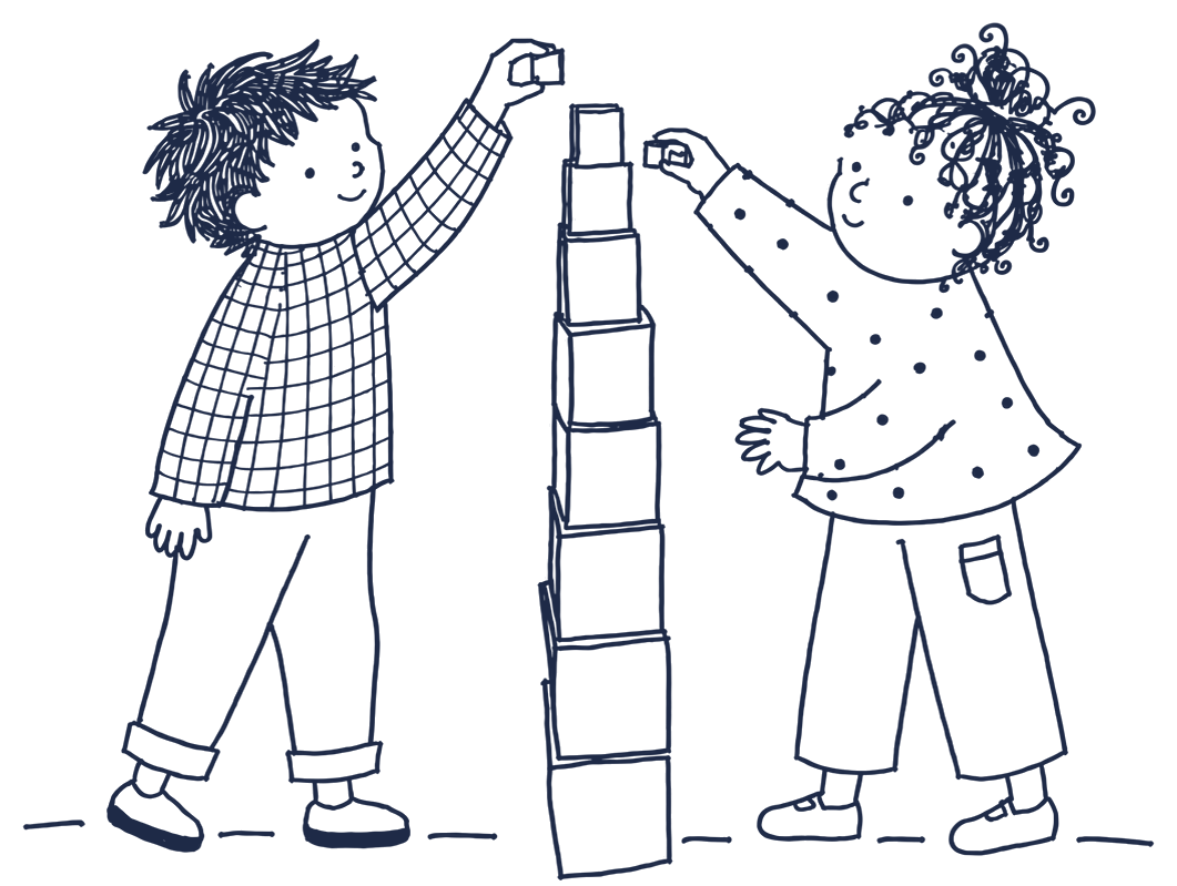
Every material has a purpose, and often more than one.
Montessori materials are made to be handled. Each one has a direct aim, the skill it teaches, and an indirect aim that prepares the child for what comes next. The knobbed cylinders, for example, teach size, while strengthening the fingers a child will later use to hold a pencil. Many materials are self-correcting, so children can spot their own mistakes and try again without being told.
Photo: pink tower, close-up
Photo: number rods on the mat
Photo: cylinder blocks
Photo: practical life: pouring
Photo: sandpaper letters
Photo: the globe
Photo: hands at work
Photo: a shelf of materials
Our special character
Faith is a gentle part of our day.
Each day we share a short time of prayer through songs and stories. Children of all faiths join in together, and every family is welcome as they are. Our teachers are trained in the Educating in Christ programme, which shapes our special character.
Our teachers
Trained teachers who know when to step back.
All our teachers are registered and permanent. We hire for the long term, so your child sees the same familiar faces every day.
“The greatest sign of success for a teacher… is to be able to say, ‘The children are now working as if I did not exist.’”
Maria Montessori, The Absorbent Mind
Photo: the teaching team, or a teacher with a child (consent needed)
Book a visit Call us
(function () {
var root = document.getElementById('smm');
if (!root || root.getAttribute('data-ready')) return;
root.setAttribute('data-ready', '1');
root.classList.add('smm-js');
var $ = function (s) { return root.querySelector(s); };
var $$ = function (s) { return root.querySelectorAll(s); };
var reduce = window.matchMedia('(prefers-reduced-motion: reduce)').matches;
var bar = $('.smm-mobilebar');
if (bar) {
var forms = $$('form[data-booking]');
var formVisible = false;
var toggleBar = function () { bar.classList.toggle('smm-is-shown', window.scrollY > 500 && !formVisible); };
if ('IntersectionObserver' in window && forms.length) {
var fio = new IntersectionObserver(function (entries) {
formVisible = entries.some(function (e) { return e.isIntersecting; });
toggleBar();
});
forms.forEach(function (f) { fio.observe(f); });
}
window.addEventListener('scroll', toggleBar, { passive: true });
toggleBar();
}
$$('[data-carousel]').forEach(function (c) {
var track = c.querySelector('.smm-carousel__track');
var btns = c.querySelectorAll('.smm-carousel__btn');
var step = function () { var s = track.querySelector('.smm-carousel__slide'); return s ? s.getBoundingClientRect().width + 20 : track.clientWidth; };
var update = function () {
btns[0].disabled = track.scrollLeft = track.scrollWidth - 2;
};
btns.forEach(function (b) { b.addEventListener('click', function () { track.scrollBy({ left: step() * Number(b.getAttribute('data-dir')), behavior: 'smooth' }); }); });
track.addEventListener('scroll', update, { passive: true });
window.addEventListener('resize', update);
update();
});
var faqs = $$('.smm-faqs details');
var closeFaq = function (d) {
if (!d.open) return;
var ans = d.querySelector('p');
if (reduce || !ans.animate) { d.open = false; return; }
var h = ans.offsetHeight;
ans.style.overflow = 'hidden';
var a = ans.animate([{ height: h + 'px', opacity: 1 }, { height: '0px', opacity: 0, paddingTop: '0px', paddingBottom: '0px' }], { duration: 300, easing: 'ease' });
a.onfinish = function () { d.open = false; ans.style.overflow = ''; };
};
var openFaq = function (d) {
faqs.forEach(function (o) { if (o !== d) closeFaq(o); });
d.open = true;
var ans = d.querySelector('p');
if (reduce || !ans.animate) return;
var h = ans.offsetHeight;
ans.style.overflow = 'hidden';
var a = ans.animate([{ height: '0px', opacity: 0, paddingTop: '0px', paddingBottom: '0px' }, { height: h + 'px', opacity: 1 }], { duration: 350, easing: 'ease' });
a.onfinish = function () { ans.style.overflow = ''; };
};
faqs.forEach(function (d) {
d.querySelector('summary').addEventListener('click', function (e) {
e.preventDefault();
if (d.open) closeFaq(d); else openFaq(d);
});
var ans = d.querySelector('p');
if (ans) ans.addEventListener('click', function (e) { if (e.target.closest('a')) return; closeFaq(d); });
});
$$('.smm-letter, .smm-reveal').forEach(function (box) {
var parts = box.querySelectorAll(':scope > h2, :scope > h3, :scope > p, :scope > div, .smm-prose > p, .smm-letter__sign');
parts.forEach(function (el, i) { el.style.transitionDelay = (0.35 + i * 0.18) + 's'; });
var reveal = function () { box.classList.add('smm-is-in'); };
if ('IntersectionObserver' in window) {
var io = new IntersectionObserver(function (entries) {
if (entries[0].isIntersecting) { reveal(); io.disconnect(); }
}, { threshold: 0.15 });
io.observe(box);
} else { reveal(); }
});
var menuBtn = $('.smm-menu-btn');
var nav = document.getElementById('smm-site-nav');
if (menuBtn && nav) {
menuBtn.addEventListener('click', function () {
var open = nav.classList.toggle('smm-is-open');
menuBtn.setAttribute('aria-expanded', open ? 'true' : 'false');
menuBtn.setAttribute('aria-label', open ? 'Close menu' : 'Open menu');
});
}
$$('.smm-nav__item--sub > .smm-nav__link').forEach(function (btn) {
btn.addEventListener('click', function () {
var open = btn.parentElement.classList.toggle('smm-is-open');
btn.setAttribute('aria-expanded', open ? 'true' : 'false');
});
});
document.addEventListener('click', function (e) {
$$('.smm-nav__item--sub.smm-is-open').forEach(function (item) {
if (!item.contains(e.target)) {
item.classList.remove('smm-is-open');
item.querySelector('.smm-nav__link').setAttribute('aria-expanded', 'false');
}
});
});
var hero = $('.smm-hero');
if (hero) {
var slides = hero.querySelectorAll('.smm-hero__slide');
var dots = hero.querySelectorAll('.smm-hero__dot');
var current = 0, paused = false;
var show = function (i) {
slides[current].classList.remove('smm-is-active');
dots[current].setAttribute('aria-current', 'false');
current = (i + slides.length) % slides.length;
slides[current].classList.add('smm-is-active');
dots[current].setAttribute('aria-current', 'true');
};
dots.forEach(function (dot, i) { dot.addEventListener('click', function () { show(i); }); });
hero.addEventListener('mouseenter', function () { paused = true; });
hero.addEventListener('mouseleave', function () { paused = false; });
hero.addEventListener('focusin', function () { paused = true; });
hero.addEventListener('focusout', function () { paused = false; });
if (!reduce && slides.length > 1) setInterval(function () { if (!paused) show(current + 1); }, 6000);
}
$$('[data-quotes]').forEach(function (box) {
var qs = box.querySelectorAll('.smm-quotes__slide');
var qd = box.querySelectorAll('.smm-quotes__dot');
var qi = 0, qpaused = false;
var showQ = function (i) {
qs[qi].classList.remove('smm-is-active'); qd[qi].setAttribute('aria-current', 'false');
qi = (i + qs.length) % qs.length;
qs[qi].classList.add('smm-is-active'); qd[qi].setAttribute('aria-current', 'true');
};
qd.forEach(function (d, i) { d.addEventListener('click', function () { showQ(i); }); });
box.addEventListener('mouseenter', function () { qpaused = true; });
box.addEventListener('mouseleave', function () { qpaused = false; });
box.addEventListener('focusin', function () { qpaused = true; });
box.addEventListener('focusout', function () { qpaused = false; });
if (!reduce && qs.length > 1) setInterval(function () { if (!qpaused) showQ(qi + 1); }, 8000);
});
/* Booking form: this HTML block cannot send email by itself, so it opens the visitor's
email app with the details filled in, addressed to the centre. To receive bookings
straight into your inbox instead, swap the form for a form plugin (see the README). */
var TO = 'info@sanctamariamontessori.co.nz';
$$('form[data-booking]').forEach(function (form) {
var msg = form.querySelector('.smm-form__msg');
form.addEventListener('submit', function (e) {
e.preventDefault();
var v = function (n) { var el = form.querySelector('[name="' + n + '"]'); return el ? el.value.trim() : ''; };
var name = v('name'), email = v('email'), phone = v('phone');
msg.hidden = false;
if (!name || (!email && !phone)) {
msg.className = 'smm-form__msg smm-form__msg--error';
msg.textContent = 'Please add your name and an email or phone number so we can reply.';
return;
}
var body = 'Hello,\n\nI would like to book a visit.\n\nName: ' + name + '\nEmail: ' + email + '\nPhone: ' + phone + '\nChild\'s age: ' + v('age') + '\nPreferred centre: ' + v('centre') + '\n';
window.location.href = 'mailto:' + TO + '?subject=' + encodeURIComponent('Book a visit: ' + name) + '&body=' + encodeURIComponent(body);
msg.className = 'smm-form__msg';
msg.textContent = 'Your email app should now open with your details filled in. Press send and we will reply within one working day. If nothing opened, email us at ' + TO + '.';
});
});
})();